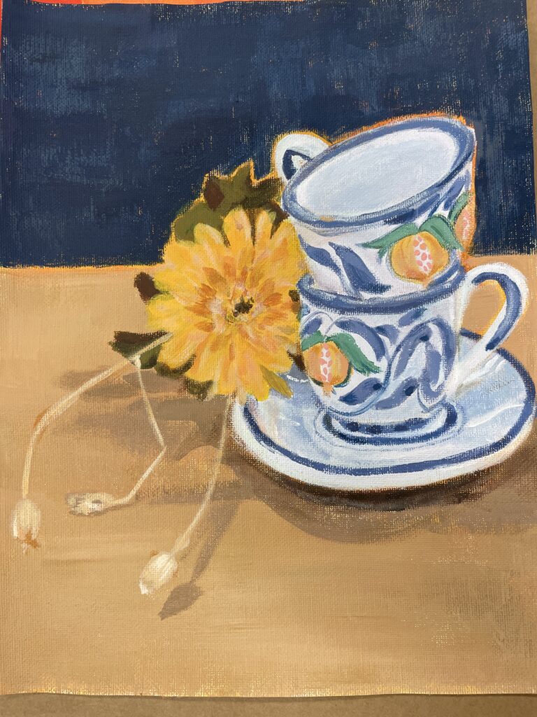
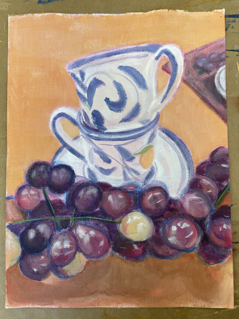
I painted these as part of an acrylic painting exercise in a Painting Processes class. We had the option to set up our own still-life scene, and something about a pair of blue teacups gave me the motivation to experiment with color schemes and perspective. I mostly consider these two pieces as color theory practice, and intentionally let the underpainting show for both paintings to give better emphasis to the subject matter.
On the left, I worked with both blurring and defining the shadows of the subjects on the table. and how to best replicate desired hues and saturations.
For the piece on the right, I started the piece with the idea that I wanted to do a rendition of the still-life with an orange tint to it, and wanted to specifically do it from this type of close-up angle. I found that the ultramarine blue I used to sketch basic shapes for the underpainting helped the colors of the grapes stand out more, which then in turn emphasized the oval shape of these grapes.